Scheduling a time to meet is both cumbersome and unintuitive. It can takes minutes, hours, days, or even weeks to finally agree on a time and place to meet. The experience of trying to meet with someone goes something like this. John emails Kate to meet for coffee to talk about a business opportunity. Kate emails back saying she's interested and asks where and when to meet. Ideally, Johns next email about the location and time would match Kate's schedule, but sadly it doesn't. They email back and forth and before you know it they have sent 12 emails. That's a lot of wasted time and effort for something that isn't always worth it.
Pick was born from the frustration the co-founders had when trying to schedule meetings with potential clients. By interviewing fellow co-workers from their company and others they found on average that 8 emails were used to set up a meeting. They tried numerous solutions from voting on times to meet to going through a list of times and comparing it to their own calendar, but none of the solutions were intuitive or smart.
To make an app that makes scheduling meetings extremely easy, quick, and efficient and eliminates the back-and-forth by comparing calendars regardless of email domain and surfacing mutual availabilities. Using machine learning to better predict when a people meet based of location, past meetings, time of day, and more, how we schedule today can be a thing of the past. Below you'll see a more in depth look into how Pick solves the problem of scheduling.
Creating this flow helped improve the app tremendously. Some insights I took away from this were; It allowed me to reduce the amount of taps it took to get from point A to point B, I found using a tab bar was a far better experience than a slide-out menu, and some screens were better suited as modals.

Having an on-boarding experience allows for new users to understand the benefits of Pick and convince them why they should use it. To not overwhelm the user I limited the amount of screens to three and used them to showcase Pick's features.

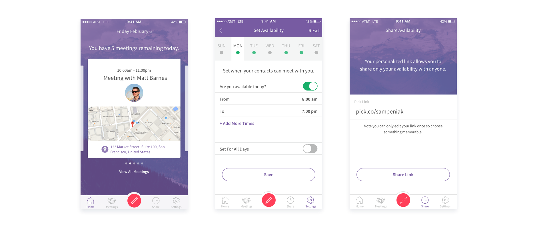
The home page was designed to focus on the users upcoming meeting or event and to show how many meetings they had for the day. Showing one card at a time allowed for that focus. Each card had the meeting details and included profile pictures of each attendee so they knew what the person(s) looked like before they met them.
Sharing one's availability was the second main action for a user to take. Sharing their Pick Link allowed for people who were not a user to schedule a time to meet easily and quickly. A very important feature of the availability was being able to set what days and times people can schedule with a user. It is much easier doing it this way then having to block out chunks of time on a calendar app.
I reduced the flow of scheduling a meeting to the bare minimum. In as little as 5 taps a meeting can be created.
The experience is suppose to feel effortless and automatic. Having things like the date and time or location pre-populated really improves the experience. When a contact is selected it is automatically populated at the top so that if a user scrolls they always know who has been invited. Details from the previous page carries over to the next so the user always has context. On the Times That Work page if there are events that take place around available times they will be shown. Accordingly times that are shown have taken into account location and travel time of other meetings or users current location.

Users no longer need a calendar app because all their meetings, events, anything on their calendar are in one location. To make this more valuable users are provided with contextual details such as a map, quick access to meeting actions, inviting others, and messaging.

They make scheduling easier because they solve two use cases. One, it allows people who don't use Pick a chance to sign up, growing the user base to continue to improve the service. Two, it provides a way for users to easily communicate about upcoming meetings, until email is removed from the equation.
To ensure that the emails would be displayed correctly across email providers and be responsive I used a combination of MailChimp and Mandrill. There is a limited use of images because most email providers don't display images by default. The design can work just as well without the images as they provide a reinforcement for the copy it's associated with. Buttons are created with code instead of images so the CTA can remain the focus. Using Arial, a system font, allows for the text to always display the way it is intended.
