Scoop's mobile apps are the only way for people to request and carpool with one another. There where three problems that made the experience cumbersome, unintuitive, and inaccessible.
By solving these problems we not only greatly improved the user experience, but created a solid foundation to easily add new features and continue making our apps more accessible.
I worked with our User Researcher to define the goals for the usability tests. Our focus was to test problems 1 and 2 from above. In order to let carpoolers explore the designs, I created multiple prototypes in InVision, which we shared with them via a link over video. I sat in on the tests to get a better understanding of how our carpoolers thought, felt, and understood about the new experiences. Below are some of the things they said that stood out.
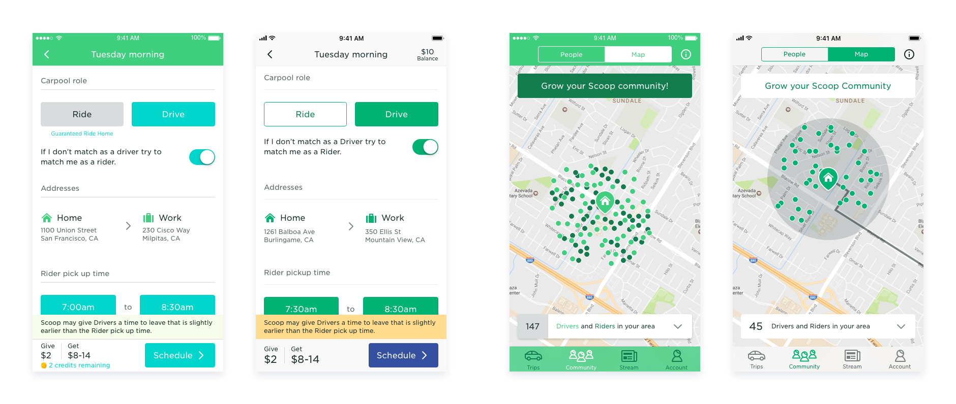
These are some of the designs we explored early on.


These are some of the designs we tested with our carpoolers.
After the user tests were completed, the User Researcher put together their findings in a doc. The doc included what carpoolers said and suggested edits to the designs.
A handful of the suggested edits were; remove the past trips section, be more clear about the status of each card, and reduce the amount of information show in the Trips tab view, carpoolers who drive and ride value different kinds of information, and carpoolers want to have ETAs.
Below are some quotes from our carpoolers that stood out.
Update the layout of the cards, the timing of when they show and expire, and which states are shown. Add a new component, the bottom sheet, to have the most important information up front and easy to access. Apply the new color palette to meet the AA contrast ratio requirement.
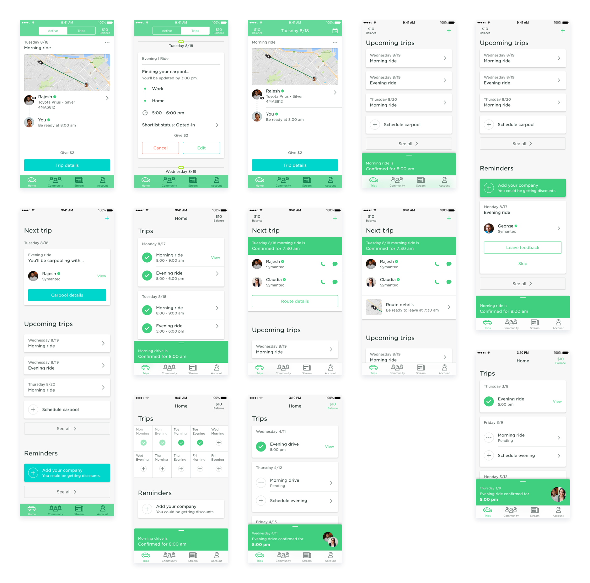
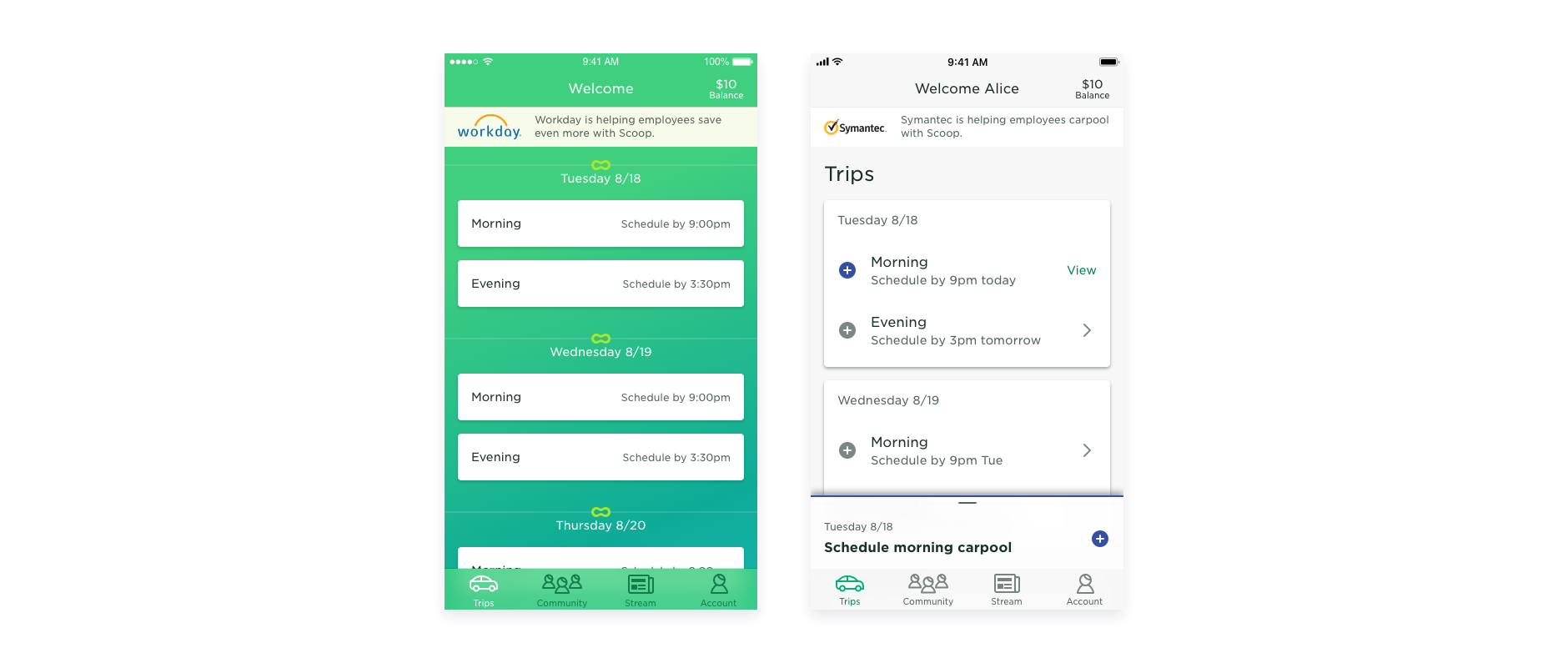
The Trips tab view is where carpoolers spend the majority of their time. They need to be able to easily and quickly access the information that is most relevant to them. When the card with the most important info is out of view and difficult to see, it makes the experience more painful. Many changes were made that greatly improved the UX. Those changes are:
Carpoolers had difficulty finding their carpool details because they were mixed in with other cards. In addition, the details could be incorrect because they were not updated based on the time or status of the carpool.
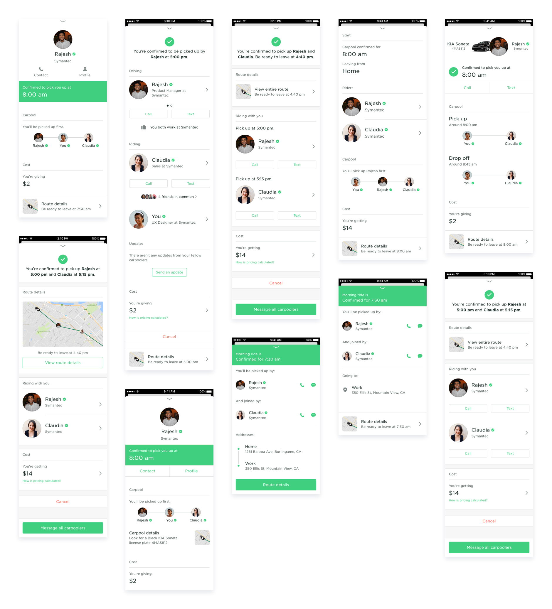
The new details were broken out into two views. The minimized view and the expanded view, both located in the bottom sheet. The minizmied view was always visible and could easily be expanded to get more details, like the map.

One significant change from the original Carpool Details view was the difference in order and hierarchy of information between drivers and riders. Drivers want to see where they're picking up their fellow carpoolers, while riders want to who's driving, their car details, and if they're are any other riders. Though there were pieces of information that were important for both, which include the confirmation of when they're picking up or being picked up, the ability to text or call each other, and the ability to cancel.

With the new and accessible color palette the goal for applying it to the app was to reduce the noise, e.g. the amount of color and have the content be the focus. I setup guidelines as part of our design system for applying the colors.